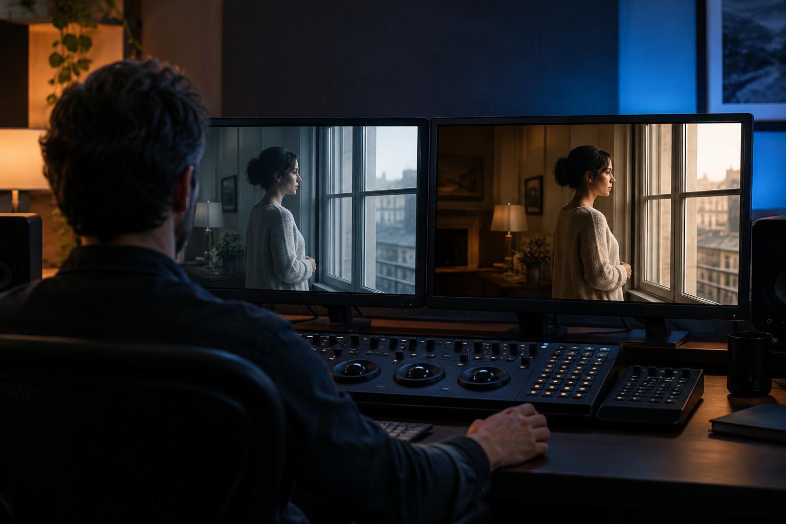
From recorded image to finished image
A camera records light, but the image it captures is not necessarily the image an audience will see. Footage may be recorded with a low-contrast appearance that preserves flexibility for later work. Even footage that looks polished on set can change when shots are placed next to one another. Color grading is the process of refining those images after filming so they work together and serve the film’s visual intentions.
The work often begins with color correction: making exposure, contrast and color balance feel consistent enough that an unintended difference does not distract. Grading then develops the look of a scene or an entire film. The distinction is useful, though the two tasks overlap in practice. A colorist may adjust a shot for continuity and, in the same session, shape its shadows to make the scene feel more enclosed.
Continuity across cuts
Imagine a conversation assembled from close-ups filmed at different times of day. Light through a window may have shifted, or one camera angle may have recorded warmer skin tones than another. When the edit moves between those shots, the differences can make the space feel unstable. Grading can bring their brightness and color relationships closer together, allowing the viewer to stay with the conversation rather than notice the cut.
Consistency does not mean making every shot identical. A face near a lamp should not necessarily match a face beside a cool window. The goal is a believable relationship between images. Colorists also work to preserve detail in highlights and shadows where the footage allows it, so a bright window does not pull too much attention or a dark costume does not disappear into the background.
Atmosphere, attention and story
Grading can affect how a scene feels without changing its action. Lower contrast may soften a quiet exchange; deeper shadows may make a familiar room feel less welcoming. A restrained palette can bring visual order to a busy setting, while vivid colors can emphasize its energy. These effects are not fixed rules: a warm image is not automatically comforting, and a cool one is not automatically sad. Their meaning depends on the setting, performance and surrounding scenes.
Color also helps direct the eye. If a character stands in a crowded frame, subtle adjustments to brightness or saturation can make the character easier to notice without looking artificially lit. A grader might reduce the intensity of a distracting background color or keep a face readable as the actor moves through shadow. Those choices support the edit by helping viewers find the detail that matters at a particular moment.
A look shaped by collaboration
A film’s palette is rarely invented only at the grading stage. Production design, costumes, locations, lighting and camera settings have already determined much of what is available to shape. A saturated red coat, for example, has a different presence from a neutral one before either image reaches a colorist. Grading can emphasize or restrain that red, but it cannot replace all the decisions made during production without the result looking strained.
The director, cinematographer and colorist may discuss which differences should remain visible. Perhaps a sequence needs to feel distinct from the rest of the film, or perhaps its shifts should be nearly imperceptible. A useful grade gives those choices consistency across many shots. It can also help a transition between scenes feel deliberate: a change in contrast or palette may signal a new environment while still belonging to the same film.
What grading cannot fix
Grading has limits. If an important part of an image was recorded without usable detail, changing its brightness may reveal little more than noise or a flat patch. Poor focus, unconvincing lighting and unclear visual storytelling are not color problems alone. Strong grading tends to work with the photographed material rather than trying to disguise every weakness in it.
The finished look also has to survive outside the grading room. Screens differ in brightness, color and viewing conditions, so filmmakers may check how an image holds up on more than one type of display. The aim is not to guarantee that every viewer sees precisely the same colors. It is to keep the important relationships—readable faces, intentional contrasts and a coherent atmosphere—clear enough to carry the film’s choices through to the audience.