Color begins with the world around the character
A costume is never seen in isolation. It appears against walls, furniture, landscapes and other performers, under lighting that may change from scene to scene. A red coat can command attention against a muted street, yet seem at home in a room full of warm-toned objects. When costume designers consider a palette, they are deciding not only which colors suit a character, but how those colors will behave in the world the audience sees.
That relationship can make a setting feel more coherent. Clothing that shares a few tones with the scenery may suggest that a character belongs there, even if the outfit has its own distinctive shape. A contrasting palette may instead draw the eye or make someone seem out of place. Neither approach carries a fixed meaning: contrast can signal confidence in one scene and vulnerability in another. The surrounding image gives the color its context.
Palettes can show relationships without matching outfits
Characters do not need to wear identical colors to look connected. A shared accent—a pale blue scarf, a blue lining, a blue detail in a print—can create a quiet visual link while leaving each person’s style intact. Costume color can also help distinguish groups. One circle might favor earthy tones while another tends toward cool, crisp shades. These patterns give viewers a way to recognize relationships before anyone explains them.
The most interesting choices often leave room for exceptions. A character may adopt the colors of a new group but keep one familiar item. Two rivals may look different in silhouette while sharing a color that hints at a common background. Such details work best when they also make sense as clothes the characters would choose, own or have access to. A palette is a storytelling tool, not a rule that every garment must obey.
A character’s colors can change gradually
A shift in costume color can make an inner change visible, but it does not have to happen all at once. A character who begins in subdued clothing might first add a vivid accessory, then later wear a stronger color across an entire outfit. That progression can feel more convincing than a sudden transformation because it lets the wardrobe retain a sense of continuity. Repeated garments can be useful, too: wearing the same jacket in a new combination may show change without implying that the character has replaced everything they own.
Color changes are not always signs of growth. A brighter outfit might be a disguise, a uniform or an attempt to meet someone else’s expectations. Likewise, a return to an earlier palette could suggest comfort, resignation or a deliberate choice, depending on the performance and scene. Looking at when a color appears, and who the character is with at that moment, is more revealing than assigning a single meaning to the hue.
Lighting and materials reshape the palette
The color of a garment on a hanger is not necessarily the color an audience will perceive. Warm or cool lighting, shadow, camera settings and nearby colors can all alter its appearance. Materials complicate the effect further. Velvet absorbs and softens light differently from satin, while sequins can catch bright highlights as a performer moves. Costume choices therefore involve more than a list of color names; they also involve texture, finish and how fabric behaves in the intended setting.
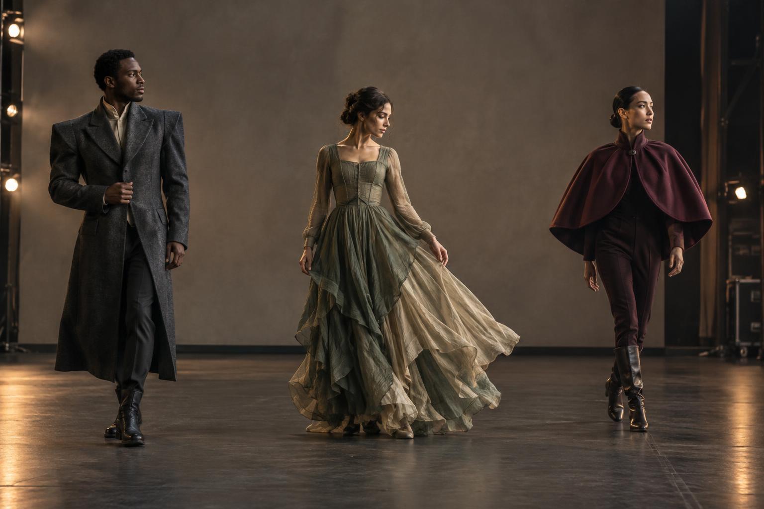
This matters on stage as well as on screen. A costume may need to read clearly from a distance, remain distinct from the backdrop or work under several lighting states. On screen, close views may reveal subtle differences in tone and texture. In either medium, testing an outfit in its visual environment helps show whether it supports the scene. A palette that looks elegant in a fitting room may disappear into a set—or become far more prominent than intended.
How to watch costume color at work
To notice a palette, start with a wide view of a scene rather than one outfit. What colors dominate the setting? Which character blends in, and which one attracts attention? Then look across scenes for repetition: a recurring accent, a color reserved for certain spaces or a garment worn differently over time. It can also help to watch moments when several characters share the frame, because their costumes reveal how individual palettes relate to one another.
Not every repeated color is a coded message. Practical considerations, personal taste and the needs of a scene all shape clothing. Still, paying attention to color can deepen the pleasure of watching. Costumes help place performers within a visual world, and small shifts in that relationship can make a story easier to feel—even when no one says a word about what they are wearing.